Documentation menu
Dashboards
The home dashboard, dashboards you build yourself, and how panels, time ranges and live mode work.
Test results answer questions about one target. Dashboards answer questions across many of them, which is most of the questions worth asking once you have more than a handful of tests.
Home
Home is the dashboard you land on. It is scoped to your organisation rather than to any one test, and it is where the “is anything wrong” glance belongs.
It is editable like any other dashboard. Treat the default arrangement as a starting point: the panels that matter to a team running three sites are not the ones that matter to a team running sixty.
Dashboards you build
Under Dashboards you can create as many as you want.
The useful unit is a question or an audience, not a system. A dashboard called “Dublin office” that puts the WAN path, the local DHCP check, the wireless picture and the SNMP counters for the site’s switch on one screen is worth more than four dashboards each covering one technology everywhere, because when Dublin rings it is Dublin you need.
Create, rename and delete from the dashboard list.
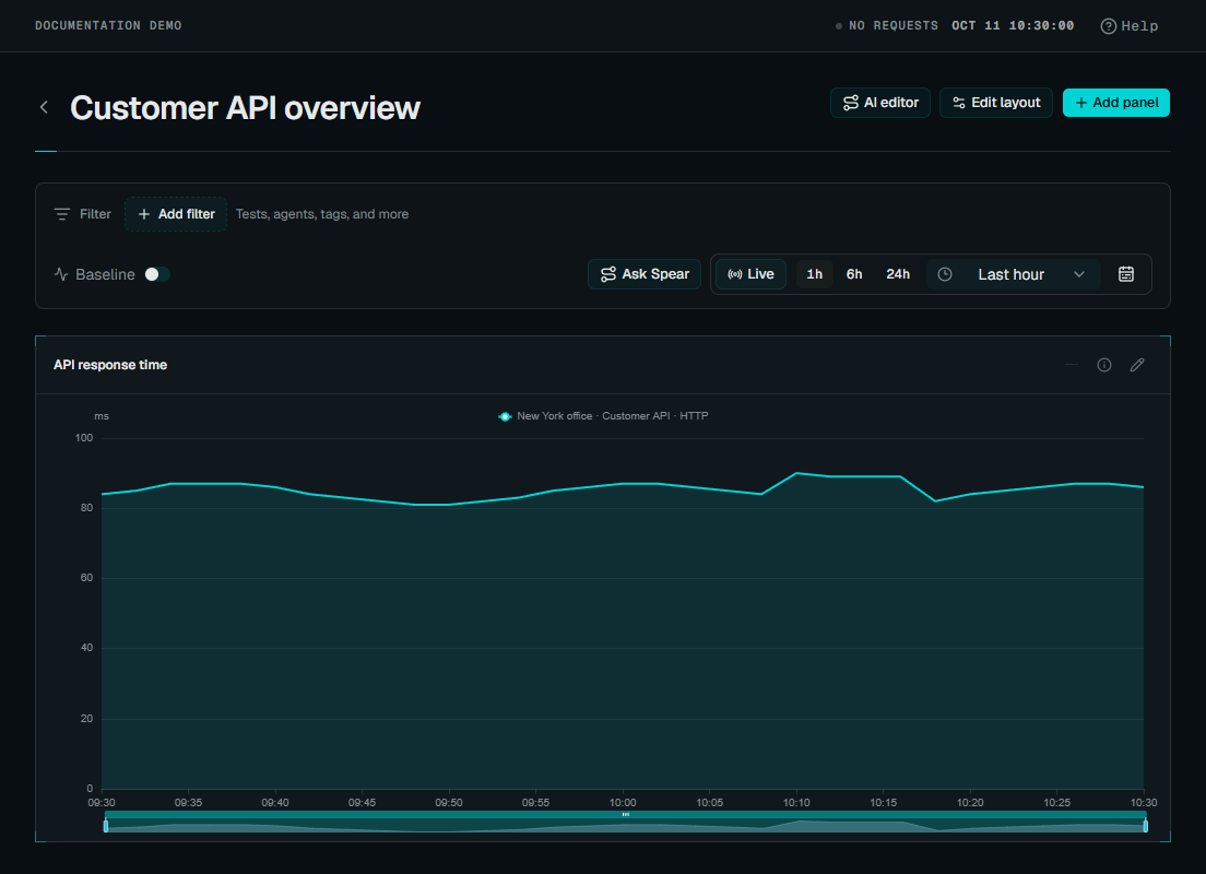 Enlarge screenshot
Arranging panels
Dashboards use a twelve-column grid. In edit mode, drag a panel to move it and drag its corner to resize; the layout saves as you go.
Add panel opens a picker with three kinds of thing:
- Visualisations: an empty chart of a given shape that you then point at data.
- Recipes: a pre-configured panel for a common question, which is usually faster than building the same thing from parts.
- Widgets: fixed panels showing platform state rather than a metric query: test health, agent status, recent ingestion, open alerts, and a map of your agents.
Selecting a panel and opening its properties lets you choose metrics, restrict it to particular tests or agents, group the series, and set colours. Panels covers that in detail.
Dashboard  (one time range, one live toggle, applies to every panel on it)
   │
   ├── Visualisation ── points at data: a structured pick (test/agent +
   │                     metric) or the query language, for any dimension
   ├── Recipe         ── a pre-built visualisation for a common question
   └── Widget         ── platform state, not a metric query: test health,
                          agent status, open alerts, a map of your agents
Time range and live mode
The range control at the top applies to every panel at once, with presets from 15 minutes to 30 days.
One range for the whole dashboard is deliberate. The most common way to misread a dashboard is to compare two panels that are not showing the same period, and making the range global removes that mistake rather than trusting you not to make it at four in the morning.
Dragging across a chart zooms every panel to that span, which is how you go from “something happened this afternoon” to the ninety seconds that matter.
Live keeps the dashboard current as new data arrives, for wall displays, and for watching a change take effect. Turn it off while investigating, because a view that shifts under you is hard to reason about and harder to screenshot.
The address bar retains the range, Live setting, chart zoom, filters and open panel tabs. Copy it to share a view or bookmark it for later. Browser Back and Forward restore those choices. A rolling preset stays relative; a custom range, zoom or paused Live view keeps exact timestamps. These reader choices leave the saved dashboard layout unchanged.
Dashboards display; alerts watch
A dashboard is something you look at. Watching a condition continuously and being told about it (without a person staring at the chart) is a separate area, Alerts, with its own rules, policies and channels. A panel’s query and a health rule’s condition are the same query language, so a chart you keep checking by hand is usually one you should instead put a threshold on and let the platform watch. See Alerts.
Next
- Panels and metrics
- Metrics Explorer: for a question you have not built a panel for yet
- Alerts: watch a condition instead of checking it
- Reading results