Documentation menu
Panels and metrics
Choosing a visualisation, pointing it at metrics, and grouping series so a chart stays readable.
A panel is a visualisation plus a query. Choosing both well is most of what makes a dashboard useful rather than decorative.
Visualisations
| Panel | Best for |
|---|---|
| Time series | A metric changing over time. The default, and usually right. |
| Area | Cumulative or stacked quantities. |
| Bar | Comparing discrete things at one moment. |
| Stat | One number that should be readable across a room. |
| Gauge | One number against a range you care about. |
| Table | Many series where the values matter more than the shape. |
| Heatmap | Distribution over time, where an average would hide the tail. |
| Compare | The same metric across tests or agents, side by side. |
| Map | Anything with a geographic dimension. |
Path-specific panels are also available where the data supports them: the per-hop path canvas, the geographic path map, and the timeline.
Heatmap deserves a mention because it is under-used. Latency is rarely normally distributed, and a mean that looks steady while the ninety-fifth percentile doubles is exactly the situation users complain about and dashboards miss.
Choosing metrics
Open a panel’s properties and pick metrics from the combobox. The metrics offered depend on the checks in scope, since an HTTP check and a WiFi scan have nothing in common to plot.
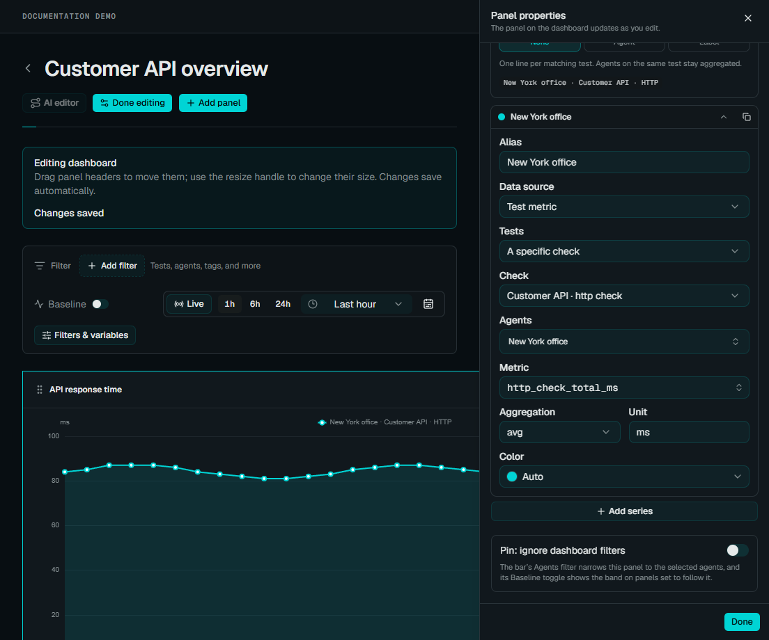 Enlarge screenshot
You can scope a panel to particular tests or agents. Two common patterns:
One metric across many tests: latency for every site, on one chart. Good for spotting the outlier. Use grouping to keep the series distinguishable.
Many metrics for one target: loss, latency and jitter for a single path. Good for understanding one thing properly.
Query language series
A series’ Data source can also be Query language: the same text the Metrics Explorer runs, as a panel’s series. This is how a panel reaches across every test in the tenant at once, filters by any dimension, or groups by something no structured picker offers:
http_check_total_ms{target=~"api-.*"} | max by (agent_id)A query series is either typed here (the text lives in the panel) or a saved query, in which case the panel holds only a reference and follows the saved query whenever it is edited. Fix a shared saved query once and every panel built on it updates. A private saved query resolves only for its owner; a panel a colleague builds on it will report it as missing.
The typed editor shares Explorer’s IntelliSense: Ctrl+Space suggests metric
names, source fields with units, filters, aggregations, joins, calculated
aliases, and baseline arguments. Dashboard variable names are offered after
${. Source pipelines can return several named measurements; see the
query walkthroughs
for examples and the distinction between ranking chart entities and selecting
one output for an alert.
A query’s by (...) decides how many lines it draws, so the panel’s own
Group by and Aggregation controls do not apply to it. Each line is
named from the query: the alias (or the metric name) followed by the group’s
dimension values, so Latency grouped by agent_id gives
Latency · edge-1, Latency · edge-2, and so on. Unit is read from the data
unless the series sets one.
One query may produce at most 80 lines, the same ceiling a grouped structured series has. Past it the panel shows the server’s message asking for a narrower query, and (because a dashboard fetches every panel’s series in one request) a query that cannot run reports that inside its own panel rather than blanking the others.
Grouping
Grouping decides how results become series. Grouped by agent, you get one line per vantage point; grouped by test, one line per target.
This is where labels earn their keep. A panel grouped by a label plots one
series per label value, so a panel built on site gains a line automatically
when a new site appears, no dashboard edit, no forgotten office. Label your
tests consistently and dashboards stop needing maintenance.
The practical limit is legibility. Past roughly a dozen series a time-series chart becomes a texture rather than information; that is the point to switch to a table, a heatmap, or a narrower scope.
Colours
Series colours can be set explicitly. Worth doing for anything a team looks at repeatedly under pressure: if the primary circuit is always the same colour on every panel, people stop reading legends and start reading shapes.
Saving
Dashboard panels save as you edit.
On a test’s Results tab, panels behave the same way but belong to a view, which you save by name. See reading results.
Next
- Dashboards
- Metrics Explorer: query a metric directly, before building a panel around it
- Infrastructure
Choose a panel for the question
- Compare a value over time: start with a time-series visualization and keep its unit visible.
- Inspect one current reading: use a single-value panel and confirm the selected time window.
- Compare locations: preserve the agent or site grouping so separate vantage points remain visible.
- Organize related views: use a layout container; select the destination before adding another panel.
The panel picker keeps its title visible while templates scroll. Configure the panel’s data and appearance in its properties, then check the result before saving the dashboard. A template is a starting point, not evidence that a query has data.
See dashboard filters and dimensions before sharing a view with variable-driven queries.